Colour Without Guesswork: Choosing Internal Door Shades for the Way British Homes Actually Get Light
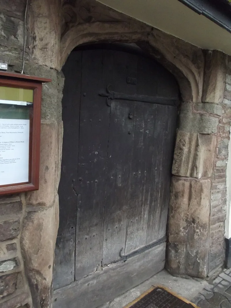
Photo: Elliott Brown from Birmingham, United Kingdom, CC BY-SA 2.0, via Wikimedia Commons
Painting an internal door is the cheapest significant change you can make to a room. No joiner, no delivery lead time, no argument about whether the frame is square. A tin, a brush, a weekend. Which is precisely why it stings when the colour you fell for under the strip lights of a decorating centre turns out to look like cold porridge in your hallway.
The problem is rarely the colour itself. It is the light. British homes are not lit evenly, and a door sits in the most awkward spot in the room — vertical, in a frame, usually opposite or beside the main window, catching whatever arrives at an angle. Get that relationship right and a modest door looks considered. Get it wrong and people will assume the paint was a mistake.
Start With the Light, Not the Colour Chart
Before you open a fan deck, answer three questions about the room.
Which way does it face? What is directly outside the window — a hedge, a red-brick wall, a pale patio, a neighbour's extension? And when do you actually use the room?
That last one matters more than people expect. A west-facing kitchen is a completely different space at 7am and 7pm, and the door will be seen in both. A north-facing box room that you only enter to fetch the ironing board can take a bolder door than a sitting room you live in from breakfast to bedtime, simply because you are never in it long enough to get tired of the colour.
Also worth noting: bounce light is real. A room with a cream carpet and pale walls will reflect far more light onto the door than the same room with a dark rug and a bookshelf against the window wall. The door is not lit independently. It is lit by the room.
North-Facing Rooms: The Undertone Trap
North light is cool, blue-leaning and remarkably consistent. It will not flatter everything, but it does reward warm colours that have a bit of body to them — soft stone, putty, warm off-whites with a hint of yellow or brown, muted ochre, a gentle mushroom.
Where it punishes you is with cool greys and anything with a blue or violet undertone. These can read as genuinely grey-blue in a north-facing hall, and grey-blue in a narrow hall with a radiator and a coat rack is not the calm Scandi moment you had in mind. If a paint is described as "storm" or "mist", test it north-facing before committing.
In a dark hallway, the classic trick still works: take the door a shade or two lighter than the walls. Not white against charcoal — that turns the door into a bright rectangle floating in gloom — but a half-step lighter. The door recedes, the walls do the work, and the corridor feels longer rather than narrower.
South-Facing Rooms: When Bright Turns Brash
South light is warm, direct, and generous. It has a habit of lifting any paint with a yellow base into something noticeably more yellow by mid-afternoon, and it will make a strong colour shout rather than speak.
This is where mid-tones earn their keep. Sage, clay, soft terracotta, duck-egg with a green lean, a deep blue that stays deep. These hold their identity through the full arc of the day. Very pale tints, on the other hand, can wash out entirely in a room that gets six hours of sun — you end up with a door that is technically painted but reads as "off-white, slightly dirty".
If you want a pale door in a very bright room, choose one that is paler than you think and check it at noon. It will not look that way at 4pm in November, and that is fine — but it should at least look deliberate at midday in June.
East and West: The Half-Day Rooms
East-facing rooms are cold and clear in the morning, flat by early afternoon. West-facing rooms are dim until lunchtime and then warm, golden and slightly orange by evening. Both change character more than north or south rooms do.
The safest approach is a colour that behaves decently in both lights and saves its drama for the accessories. Mid-tone greens, warm greys with a brown rather than blue base, and muted olive all work. Two things to be careful of: pinks and reds in west-facing rooms can go muddy under that evening gold, and anything very cool in an east-facing room can look unresolved before ten in the morning.
Sheen: The Part Everyone Forgets
You can pick the perfect colour and still get it wrong by buying the wrong finish.
Modern water-based eggshell is the sensible default for internal doors. It is hard-wearing, wipeable, and low-odour. Satinwood sits a step glossier and suits hall doors, bathroom doors and anywhere hands land frequently, because it cleans up more readily. Full gloss belongs on period panelled doors where the joinery is good enough to carry it — it will amplify every dent, every filled hole and every brush mark, so only use it if the preparation is genuinely thorough.
Sheen also changes how a colour reads. A glossier finish reflects more, appears deeper, and takes on the colour of whatever is opposite it. That is flattering on a front-facing door and less so on one beside a dark bookcase.
One practical point: heavily matt finishes look beautiful in photographs and show every fingerprint in real life. If the door is in a hallway with children, dogs or a habit of being pushed open by a shoulder, go a step up in sheen.
Period Detail: Where the Colour Actually Lands
On a four-panel Victorian door, paint does not sit on a flat plane. It wraps mouldings, sits in the shadow of a bead, catches the light on a stile. A colour chosen on a flat sample chip can look quite different once it is broken up by profile.
As a rule, painting panels and stiles the same colour makes a modest door look taller and more confident. Contrasting panels is a lovely detail but it draws attention to the door rather than letting it settle into the wall.
Architrave and skirting matter just as much. Carrying the wall colour onto the architrave makes the opening feel wider and the door disappear. Painting the architrave in a contrasting shade does the opposite — and in a small room, that is usually the wrong trade.
Test It Properly, or Don't Bother
A two-inch square painted on the back of the door tells you almost nothing. Do this instead: take an A3 offcut of primed MDF, give it two coats, and move it around the room — beside the door, against the skirting, next to the sofa, at 8am and again at six. Look at it with the ceiling light on. Look at it next to the floor you are keeping, not a floor you plan to replace one day.
And write the colour and finish on the back of the board. You will want it in three years when a handle catches the paint.
A Whole-House Scheme Without Cloning Every Room
Three workable approaches exist. One: a single door colour throughout, with walls doing the varying. Two: doors match walls in some rooms and contrast in others, deliberately. Three: a thread — the same colour family at different depths, so the hall door is soft stone, the sitting room door is a deeper mushroom, the study door is a darker brown-grey.
The governing rule is sightlines. Doors you can see from one another should have a relationship. The hall and landing almost certainly should agree, because the landing is visible from the hall and vice versa. Beyond that, upstairs can be braver than downstairs, and rooms behind closed doors can please themselves.
Small, self-contained spaces — a downstairs loo, a box room, a utility — are where a deep colour genuinely earns its place. It makes a small door look intentional rather than overlooked. Just avoid near-black in a windowless hallway; without light to catch the edges, it reads as a hole in the wall rather than a door.
Finally, the unglamorous bit. Paint fails on preparation far more often than on colour. Sand, fill, prime, and if the door has been waxed or varnished, use the correct primer or the new paint will simply slide off in a year. The colour you choose is only ever as good as the surface underneath it.